For older release notes : Release notes archives.
2026-11-19
[New] Narrower fields for better readability
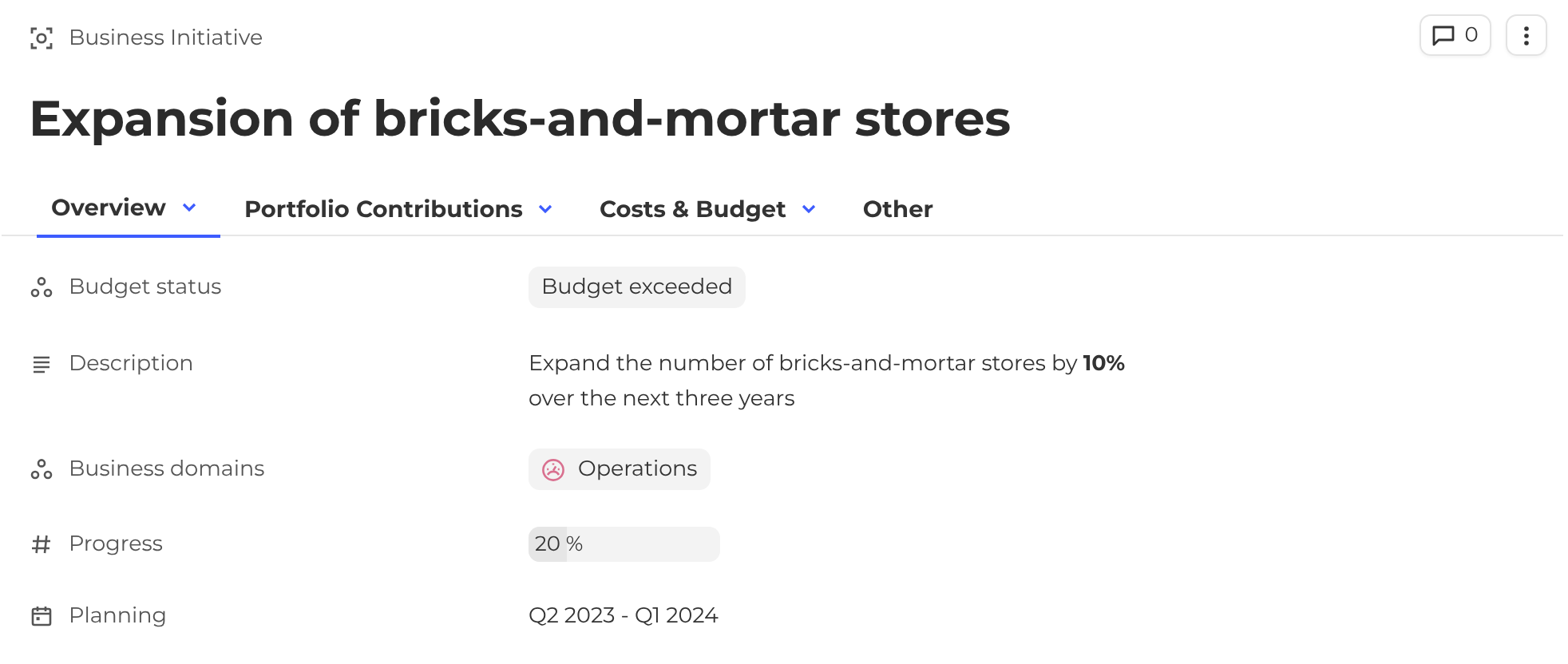
Fields displayed in Single line and Single column no longer stretch across the full width of the page. Labels now sit closer to their values, so instance pages are easier to read.
-
Single column: the label and the content are each limited to 700 px.
-
Single line: the whole field is limited to about 700 px, split into about 300 px for the label and 400 px for the content.
-
Views: the view content still uses the full available width.
-
Messages and banners: limited to 700 px.
Before
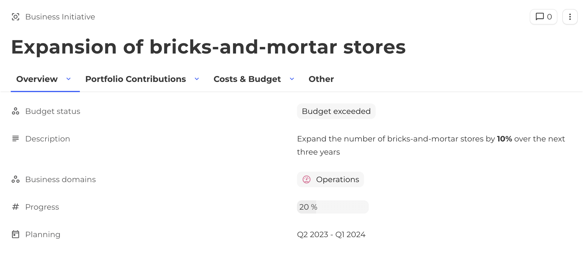
After
2026-11-05
[New] Card widget blocks
Build cards with as many blocks as needed
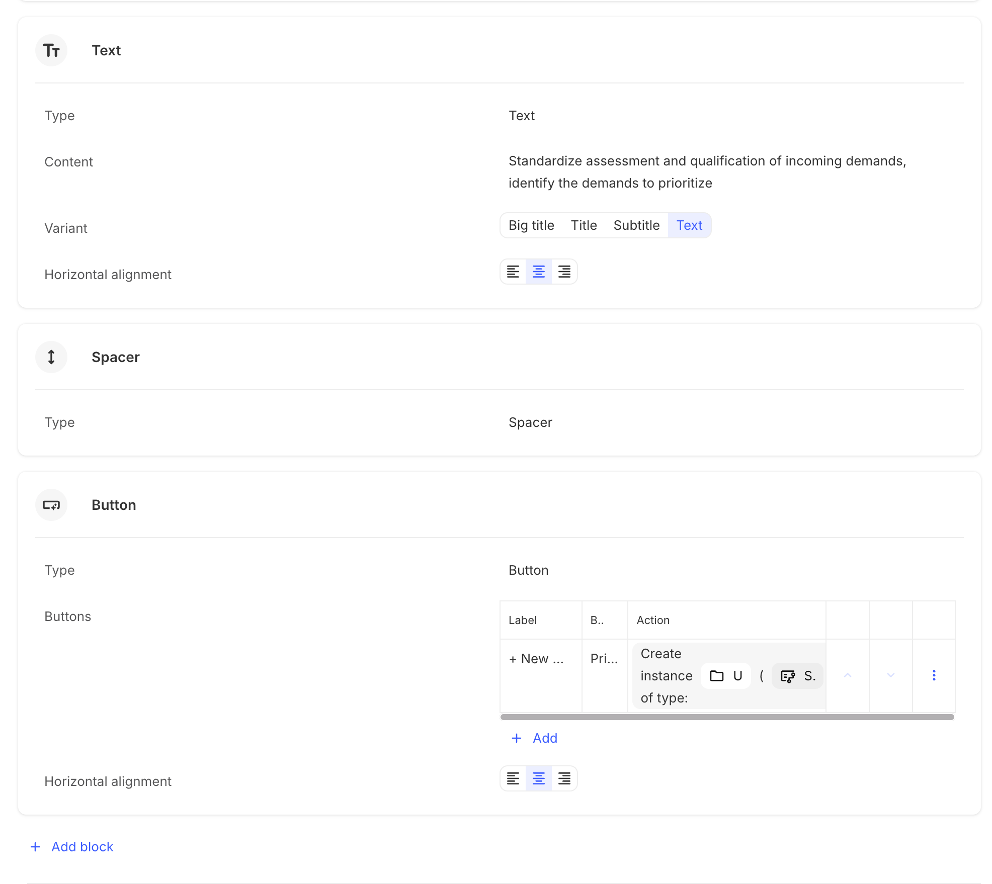
The Card widget no longer uses a fixed layout. Previously, a card could contain at most one image, one text, one subtitle, and one button. Cards are now composed of blocks, with no limit on their number or type. A card can hold several images, several texts, several buttons, in any order. Existing cards are migrated automatically, with no action required.
What’s new
Add as many blocks as needed, of any type
-
Text: Big title, Title, Subtitle, or Text variant.
-
Button
-
Image
-
Separator (new): a 1px divider line.
-
Spacer (new): empty space used to position blocks vertically.
The same block type can be used several times in a card. For example, a card can combine two images, a title, a text, and two buttons.
Block management
-
Blocks are reordered with the up and down arrows, as in automations.
-
Each block can be aligned left, center, or right.
2026-09-03
[Improvement] Dimensions filters now use chip configuration
When displaying instances in dimension filters, the chips will follow the same behaviour as the displayed instances chips. This means that an icon will be displayed if an icon field is configured and filled, and the dot color will be displayed if a color field is configured and the dot color display is enabled.
[Breaking change] Matrix and Swimlane library views removed
The Matrix and Swimlane have been removed from libraries.
This change follow the deprecation of libraries.
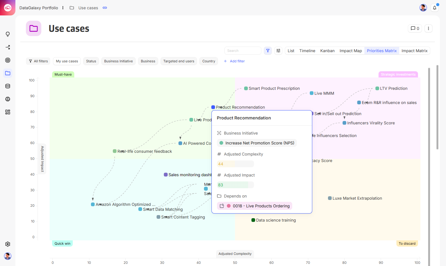
[Improvement] Card display on matrix view
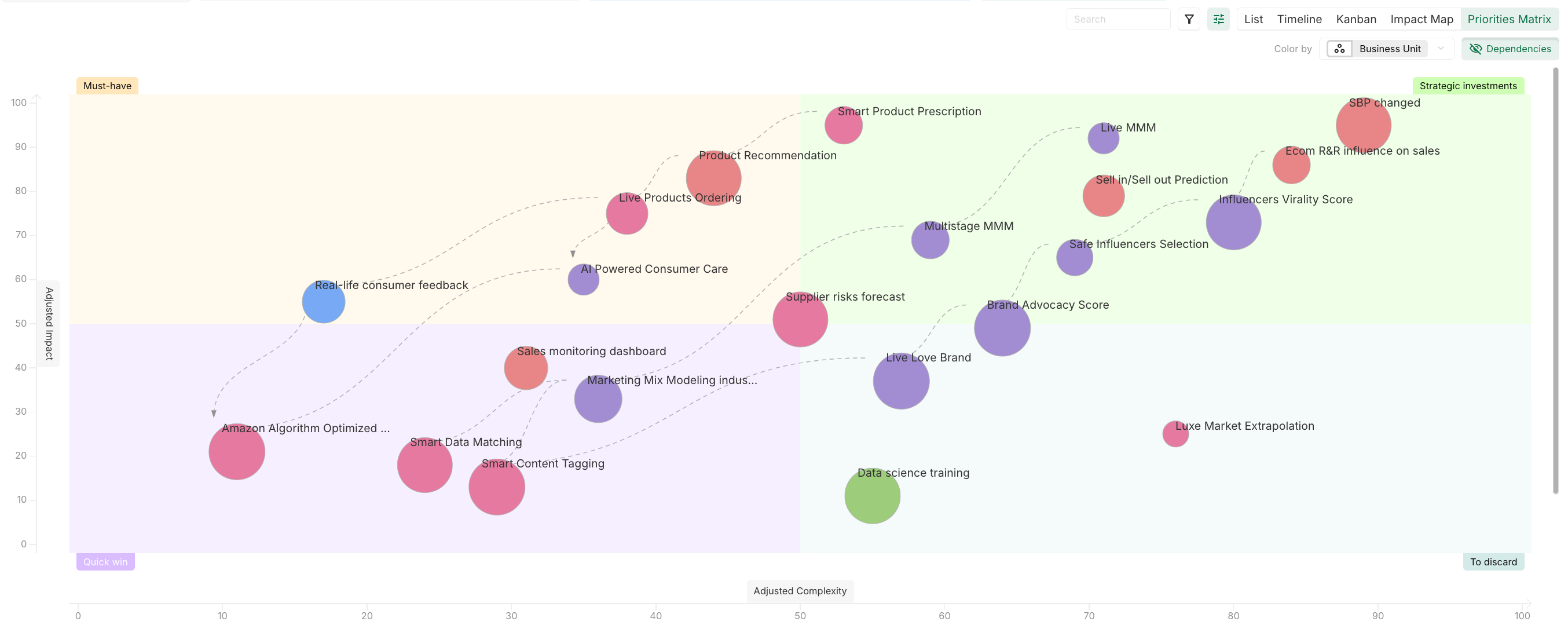
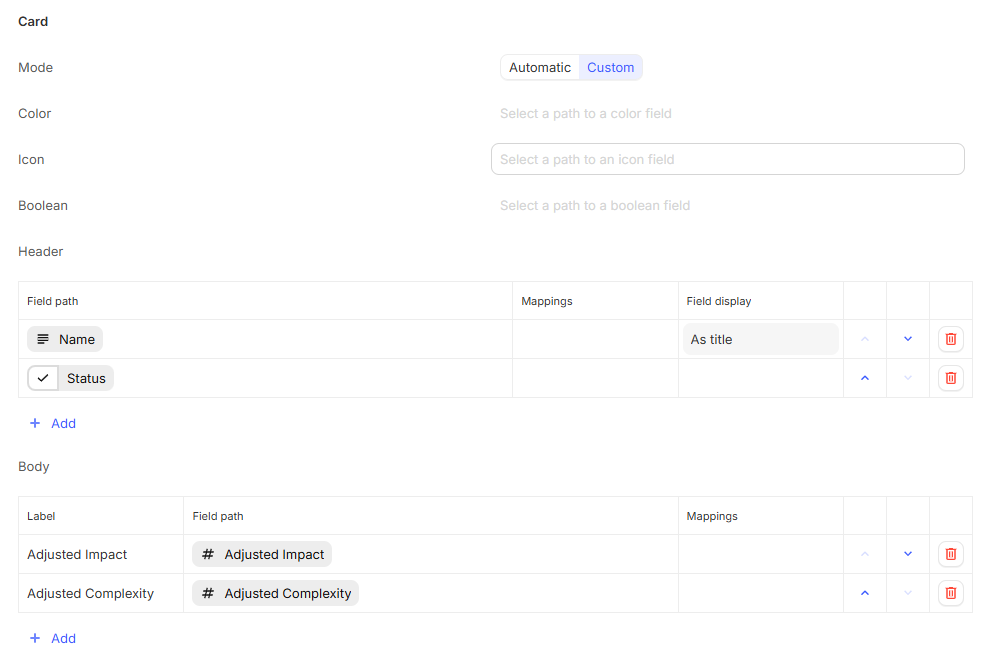
When displaying information about an instance instance a matrix view, the display now uses the standard card format.
This also give more control about the content being displayed in the card.
[Improvement] Matrix axis can now use path
In a matrix view, X-axis, Y-axis and Dot size can now be defined using a path.
2026-08-27
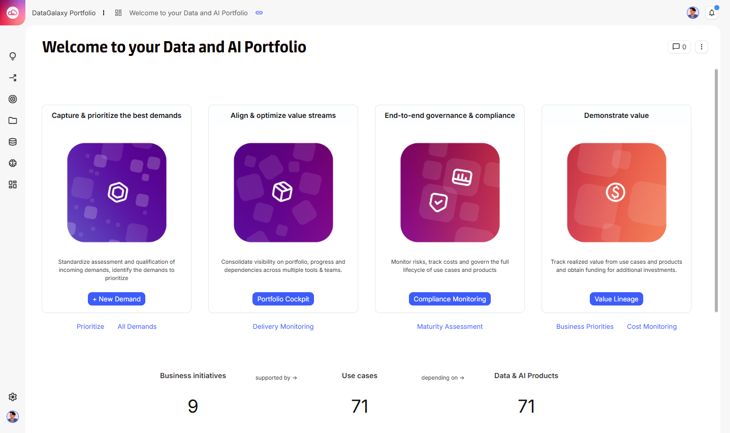
[New] Platform redesign
The platform interface has been redesigned while preserving all existing functionality.
The top bar and left navigation bar have been updated to further align the Portfolio experience with the Catalog and provide a consistent visual identity across both platforms.
As part of this redesign, the existing platform logo can now be displayed at up to 50×50 px for an optimal visual experience. Existing 20×20 px logos remain fully supported, and no logo update is required.
For assistance with updating the logo, the CSM team can be contacted.
2026-07-29
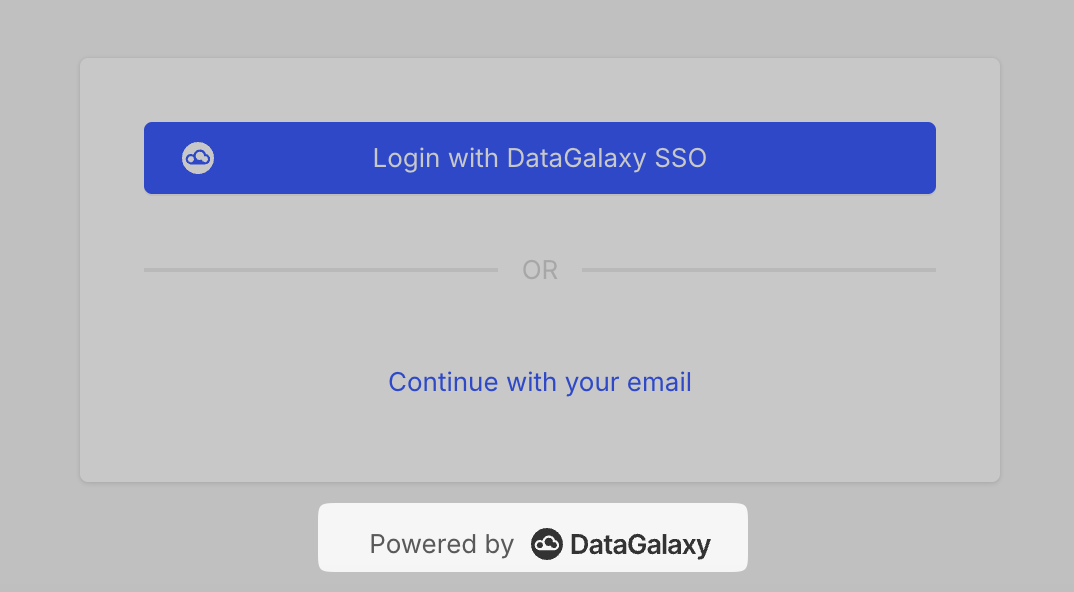
[New] Login page redesign
The login page has been redesigned while preserving all existing functionality.
This update aligns the Portfolio login experience with the Catalog login page, providing a consistent visual identity across both platforms.
[New] API IP Whitelisting
API access can now be restricted using an IP whitelist.
If IP whitelisting is required, contact the support team to configure it. Additional details are available in the dedicated documentation.
[Fix] Various filters issues
-
In view, reset filters button now properly reset the filters when there is some default filter configured.
-
Clearing the text research doesn’t reset the previously set filters anymore.
2026-07-16
[Breaking change] Role layout configuration now uses views
When roles are added to a layout, their configuration is now handled through a view instead of relying on the role library configuration.
This change makes role display configuration more flexible and aligns it with other display configurations. It also prepares for the removal of the role library, which has been deprecated for more than one year.
Existing layouts have been automatically migrated to the new configuration.
See Display Roles, Users and Groups in a table for more information on how to configure the new view.
2026-07-10
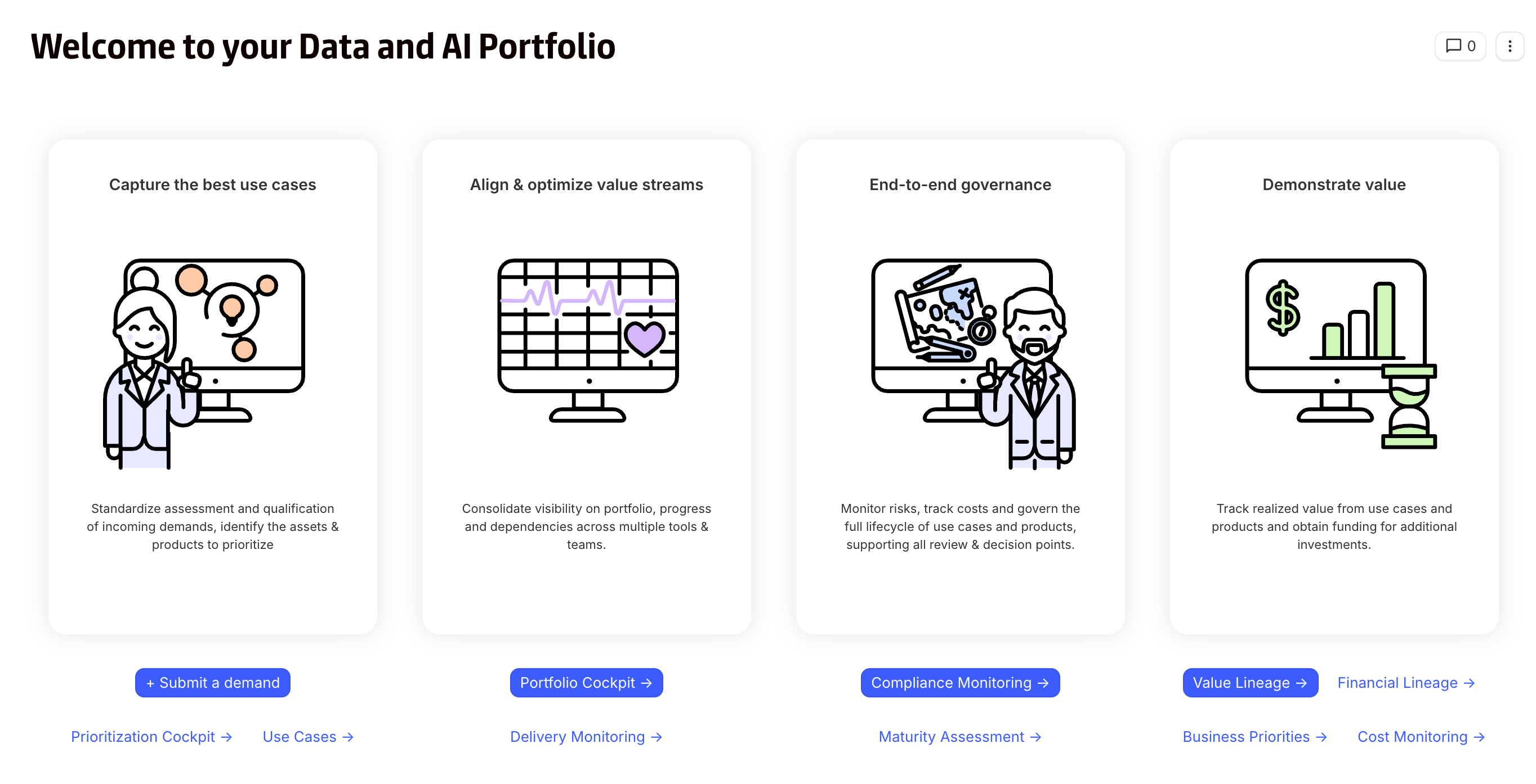
[New] New widget display modes
Widget display modes have been updated to provide more flexibility when designing dashboards.
Three display modes are now available:
-
Comfortable (new): Adds internal and external spacing to create cleaner, more readable dashboards. This mode is now selected by default for new widgets and is especially suited for building navigation dashboards.
-
Minimal: Replaces the previous Card mode.
-
Invisible: Replaces the previous Borderless mode and keeps the widget fully transparent.
The previous Colored mode has been removed. Instead, a Background color option is now available for Comfortable and Minimal widgets, making it possible to customize the appearance while keeping the same display mode.
Existing widgets are automatically migrated to the new modes without changing their visual appearance.
2026-07-02
[Breaking change] Text values are no longer trimmed in filters and formulas
Text values used in filters and formulas are no longer automatically trimmed. Leading and trailing whitespace characters, including blank spaces and line breaks, are now preserved exactly as they are stored.
Previously, any whitespace at the beginning or end of a text value was silently removed before comparisons were performed. As a result, it was not possible to perform comparisons that intentionally relied on leading or trailing whitespace.
This change makes text comparisons more faithful to the original value and enables more precise matching scenarios.
Example
When searching for the standalone word " IA " (with spaces before and after), the surrounding spaces are now preserved during the comparison.
This makes it possible to distinguish:
-
" IA "→ matches the standalone word IA in the middle of a sentence -
"TIA"→ does not match -
"Generative IA"→ does not match when specifically searching for" IA "with surrounding spaces
Previously, the spaces were automatically removed, so searching for " IA " behaved the same as searching for "IA", making this type of comparison impossible.
Impact: Existing filters and formulas that relied on the previous automatic trimming behaviour may produce different results. It is recommended to review any text comparison that could involve leading or trailing whitespace.
2026-06-25
[Improvement] Timeseries table range path support
Timeseries tables now support defining their displayed time range from a path, instead of only using a fixed range configured in the view.
This makes it possible to adapt the table period dynamically to each context.
With this improvement, the same timeseries table configuration can be reused across different instances while automatically displaying the relevant period for each one.
2026-06-11
[Improvement] Updated component border radius
The border radius of all components has been updated to give the product a more modern, refined, and up-to-date visual style.
[Improvement] Readability in grouped tables
In tables using Group by, instance colors are no longer applied to the rows within groups. This change improves readability and results in a cleaner interface.
2026-06-04
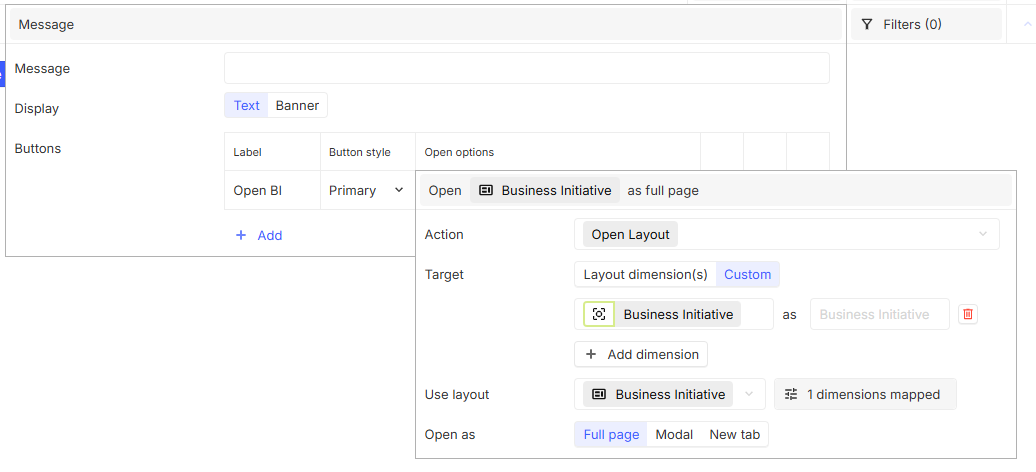
[New] Configure open behavior on layout messages
Layout messages buttons have been updated with new configuration options.
For Open Layout action, a Target can now be selected:
-
Layout dimension(s) : the button will use the layout’s dimension(s) and the selected layout : same behavior as before.
-
Custom dimension(s) : the button will use the defined custom dimension(s) and the selected layout for the dimension(s).
This can be used to open a dedicated layout with a different navigation context or a more specific user-oriented view.
A new Open as option is available besides Full page and Modal : New tab. This opens the desired target in a new browser tab.
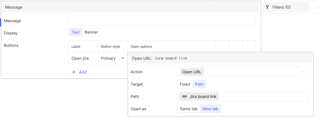
For Open URL action, a Target can now also be selected :
-
Fixed: the button will use the defined fixed URL.
-
Path: the button will use the defined URL using a path targetting a link or a text field.
This can for example be used to directly open related external objects such as Jira tickets.
Open as options are now available: Same tab or New tab.
[Improvement] Path support in filter targets
Filter expressions now support paths on the right side of a condition, where previously only fixed values could be used. This makes it possible to compare a field against another object path dynamically, instead of relying solely on static values.
This enhancement unlocks more advanced, flexible filtering scenarios and context-aware comparisons. For example:
-
Compare the planned delivery date of a use case against a date range defined elsewhere in the model:

-
Check whether a numeric value, such as a use case compliance score, exceeds a threshold that is itself stored in another field:

To make this capability easier to use, the filter target selector has also been redesigned. Instead of switching between value types through a dropdown menu, the available options are now displayed directly in the interface and can be selected in a single click, making it easier to switch between static values and paths while building filter conditions.
[Improvement] Filter advanced mode becomes the standard
To streamline the filtering experience and provide easier access to advanced capabilities, advanced Mode is now the default mode for all filters.
This change removes the need to switch modes manually and makes the full set of filtering capabilities available by default.
2026-05-28
[New] Table view & Card view: Instance creation configuration
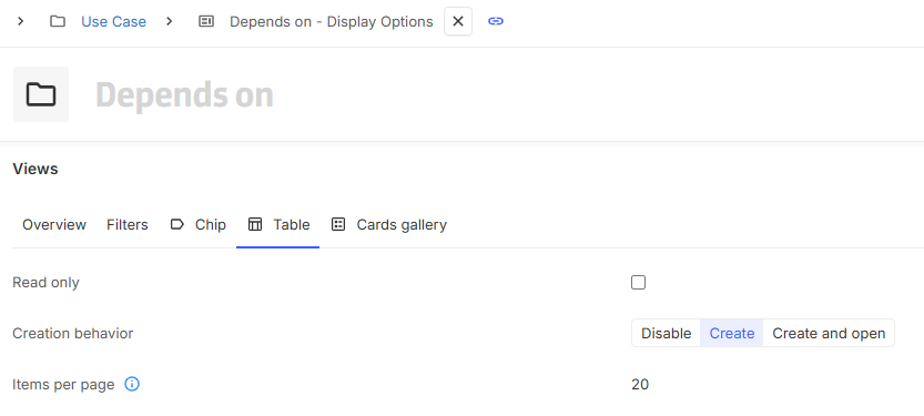
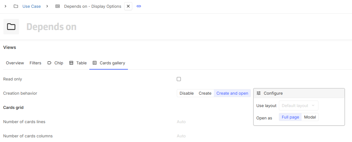
Like chip view since some week ago, table and card views now support configurable instance creation behavior.
Three options are available:
-
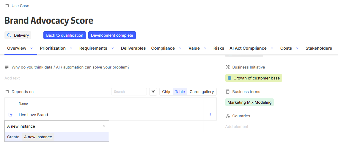
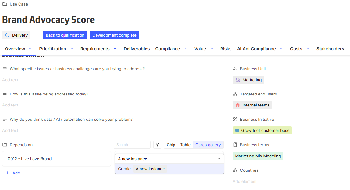
Create (default behavior): Works as previously. Instances are created directly from the view. After creation, details can be accessed by clicking the new displayed element to open the instance.
-
Disabled: Prevents instance creation from the view.
-
Create and open: Adds a new creation flow. Upon clicking create, a layout or form opens, allowing immediate input of instance details.
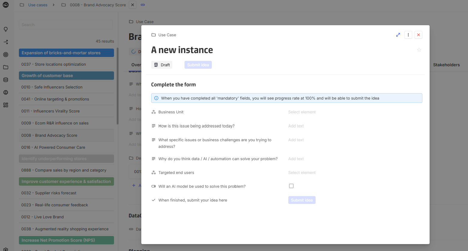
When using Create and open, the layout or form can be displayed either:
-
as a modal within the same page, or
-
as a full-page view.
In full-page mode, returning to the previous screen requires manual navigation.8
2026-05-21
[New] Configure open behavior on views
All views that have an open behavior have been updated with new configuration options

A target can now be selected :
-
View dimension(s) : opening from the view will use the view's dimension(s) and the selected layout : same behavior as before.
-
Custom dimension(s) : opening from the view will use the defined custom dimension(s) and the selected layout for the dimension(s).
This can be used to open a dedicated layout with a different navigation context or a more specific user-oriented view. -
URL : opening from the view will use the defined URL (targets a text or a link field)
This can for example be used to directly open related external objects such as Jira tickets.
A new Open as option is available besides Full page and Modal : New tab. This opens the desired target in a new browser tab.
For the Table view only, the Display button in first column option has been replaced with Open action placement chooser:
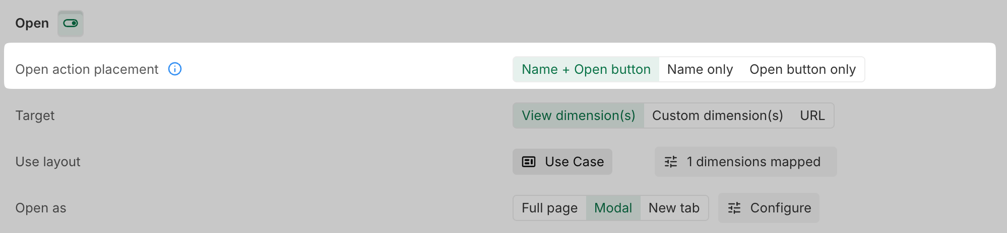
2026-05-07
[New] Chip view: Instance creation configuration
Chip views now support configurable instance creation behavior.
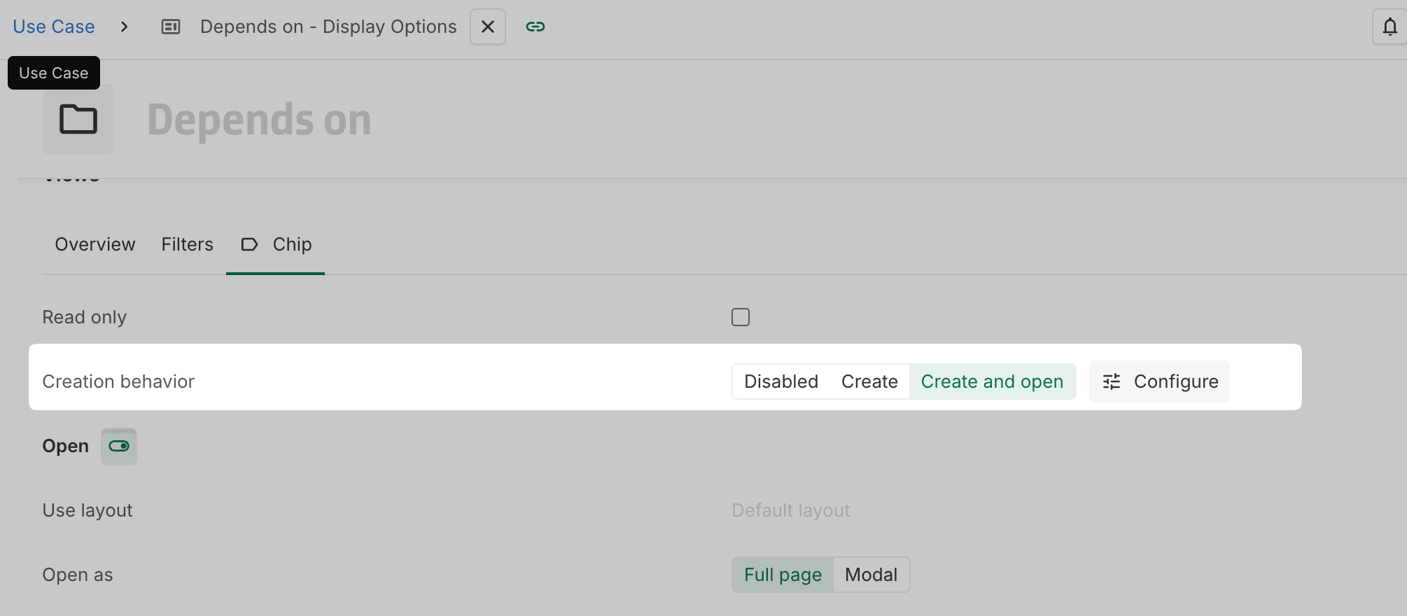
Three options are available:
-
Create (default behavior): Works as previously. Instances are created inline directly from the chip view. After creation, details can be accessed by clicking the chip display to open the instance.
-
Disabled: Prevents instance creation from the chip view.
-
Create and open: Adds a new creation flow. Upon clicking create, a layout or form opens, allowing immediate input of instance details.
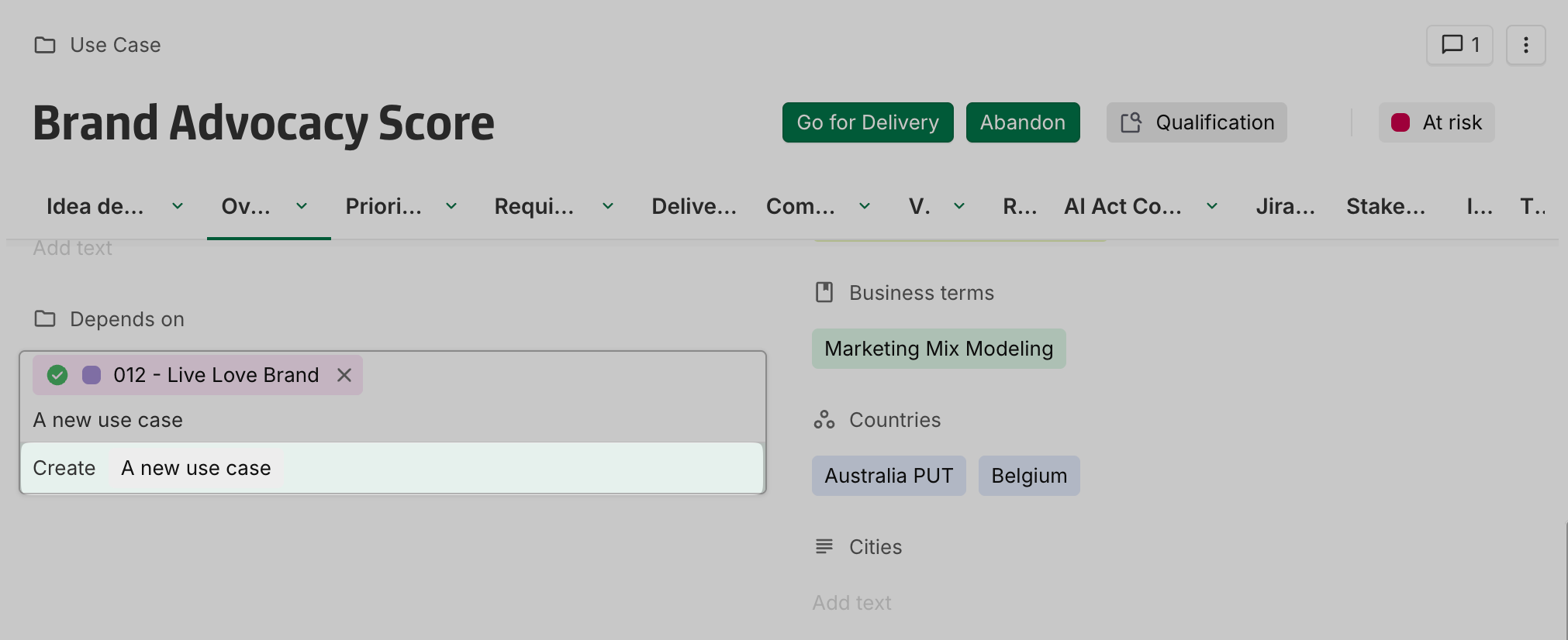
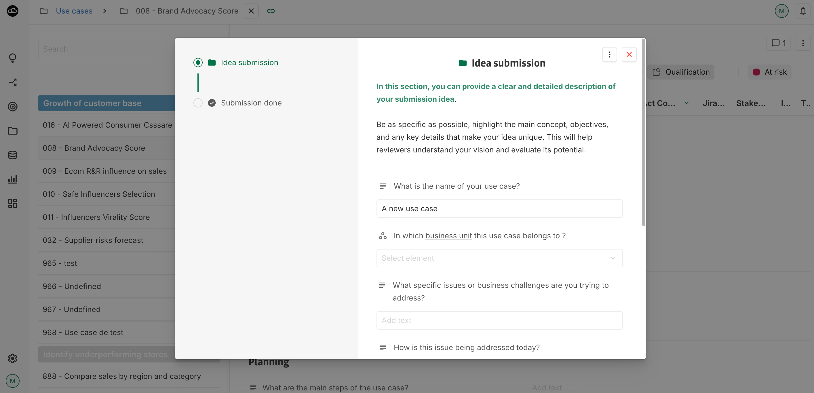
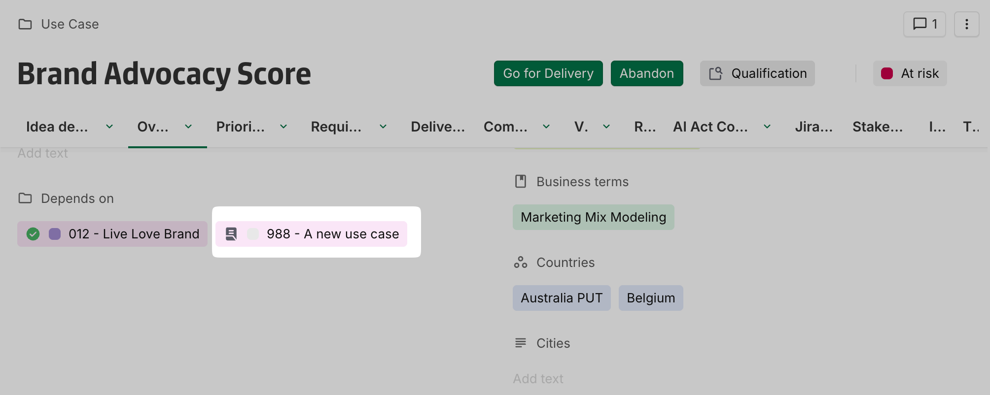
When using Create and open, the layout or form can be displayed either:
-
as a modal within the same page, or
-
as a full-page view.
In full-page mode, returning to the previous screen requires manual navigation.
This configuration is available in chip views and will soon be extended to table and card views.
2026-04-22
[Improvement] Jira Connector: New enumeration field types supported
The connector now supports additional Jira field types:
-
Select List (multiple choices)
-
Radio Buttons
-
Checkboxes
2026-04-09
[Improvement] Concept definition score update
Concept definition Score becomes Additional fields on the name line and can be used with a number, a workflow or any n-1 association.

2026-03-12
[New] Privacy policy URL
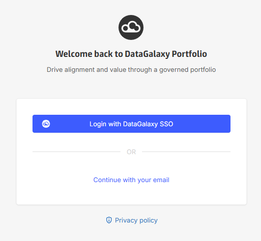
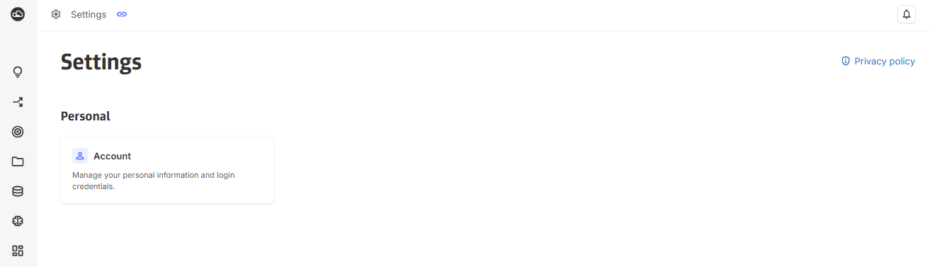
A Privacy policy URL can be set in Settings > Customization in the General tab.
When set, a link will be displayed under the login panel and in the Settings page.
[Improvement] Collibra Connector – User synchronization auto-creation disabled by default
To prevent all Collibra users from being automatically created in the platform, the connector no longer synchronizes all users during startup by default.
An option is available to restore the previous behavior if needed.
For more details, please refer to the documentation.
[Improvement] Collibra Connector – User Email mapping to external key
The Collibra user email can now be mapped to an external key.
This allows the email to populate the platform Email field when creating user accounts, ensuring valid account creation.
2026-02-05
[New] Catalog Connector: Glossary and Data processing objects
Synchronization of Glossary and Data Processing objects (excluding Data Processing Items DPIs) is now supported in the Portfolio ↔ Catalog connector.
For more details, please refer to the documentation.
[New] Catalog Connector: Link-Based Filters
It is now possible to filter objects based on their links to other objects in the Portfolio ↔ Catalog connector.
For more information, see the linkFilters option in the documentation.
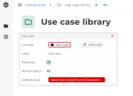
[Improvement] Required dashboard parameters
Dashboard parameters can now be configured as required.
When a parameter is marked as required, the selected value cannot be cleared, ensuring that dashboards always run with a defined parameter value.
2026-02-26
[New] DataGalaxy Catalog Connector: Workspace version configuration
A new workspaceVersionId parameter has been added to the DataGalaxy Catalog connector configuration. This parameter enables administrators to specify which workspace version the connector should use, providing greater control over version management and integration behavior.
More details are available in the documentation.
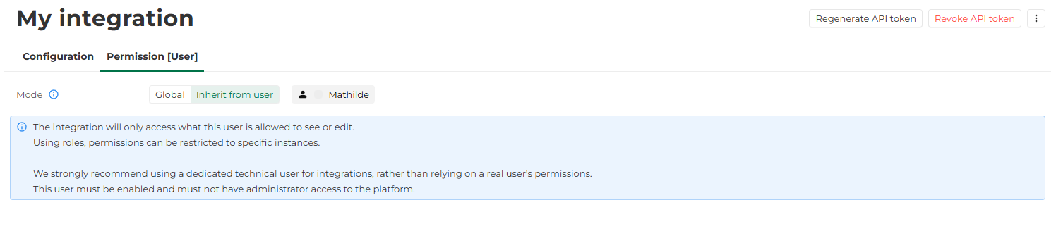
[New] Fine-grained permission for integrations
Integration permissions can now be configured based on an existing user.
In the Permission tab of an integration, two permission modes are available:
-
Global : permissions are managed at a global level, as previously.
-
Inherit from user : the permissions of an existing user are applied to the selected integration.
When using Inherit from user, the selected user must be enabled and must not have administrator privileges.
It is strongly recommended to use a dedicated technical user for integrations rather than relying on the permissions of an individual user account.
2026-02-12
[Improvement] Migration to DataGalaxy logo
As YOOI has evolved into DataGalaxy Portfolio, the platform branding has been updated to align with the DataGalaxy visual identity.
What’s changing:
-
The homepage now displays Powered by DataGalaxy instead of Powered by YOOI.
-
YOOI logos have been replaced with DataGalaxy logos across the platform, including the logo in the browser tab icon.

This is a visual update only. No functional changes are associated with this release.
2026-01-25
[Breaking change] Configuration loss in copied links containing views states
Copied link with a state for views table, timeline and matrix will no longer work.
-
Table states will miss the Group by configuration.
-
Timeline states will miss the query range, Group by and Options.
-
Matrix states will miss Color by and Dependencies.
This breaking change is the result of a bug fix.
[Fix] View state conflict when configuring multiple views of the same type
Fixed an issue where default configurations were not applied when multiple views of the same type were configured.
2026-01-08
[Improvement] Finer Dashboard Grid
The dashboard grid has been expanded from 24 to 48 columns, providing greater flexibility for widget sizing and positioning.
The minimum widget width is now four columns (previously two). Despite the change, the minimum visual size remains the same due to the increased grid resolution.
All dashboards have been automatically migrated. There is no visual impact on existing dashboards: for example, a widget that was 4 columns wide is now 8 columns wide, preserving the same relative size within the new grid.
[Improvement] Default ordering of instances applied to dimensions in the timeseries table
Dimensions in the timeseries table are now ordered according to the default order of instances defined at the concept level (Concept > Default behaviour > Sort of instances).
[New] DataGalaxy Connector: Parent Management via n-1 association or embedding
Parent relationships for instances synchronized with DataGalaxy can now be managed using either an n-1 association or an embedding field.
-
The n-1 association can be defined as the parent of synchronized instances.
-
The choice between embedding and association is configured through the
parentYOOITypeoption. -
Embedding remains the default behavior.
Details can be found in the DataGalaxy connector documentation.
[New] DataGalaxy Connector: Support for multiple DataGalaxy concepts per YOOI concept
The DataGalaxy connector now supports synchronizing multiple DataGalaxy concepts to a single YOOI concept.
-
In this configuration, the type is mandatory for the creation of instances from YOOI to DataGalaxy.
-
The type must be explicitly defined in the mapping.
Details can be found in the DataGalaxy connector documentation.
2025-12-18
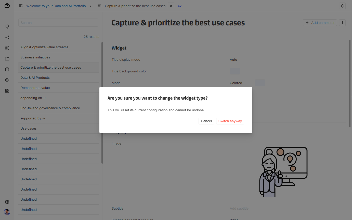
[Improvement] Widget type update confirmation
An additional confirmation step has been introduced when updating a widget’s type to reduce the risk of configuration loss from unintended actions.
2025-12-11
[New] Disable data mode in dashboard edition
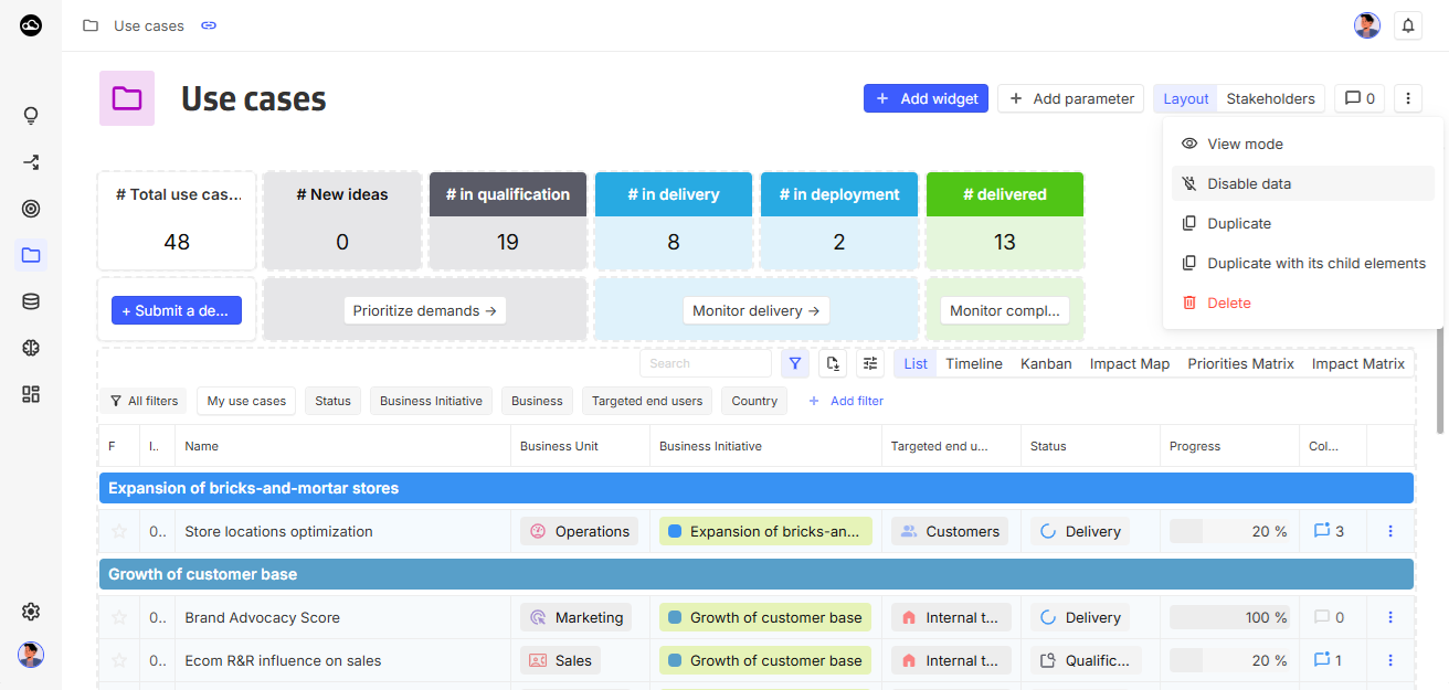
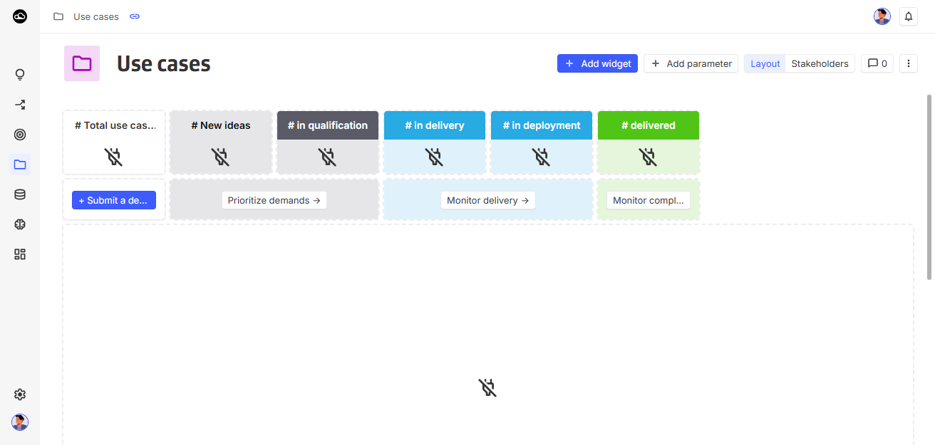
A new Disable data mode is available in edition mode. When activated, widgets do not retrieve or compute data, making dashboards much faster and easier to organize. This option is local and only affects the current user’s view, other users continue to see the data normally.
[Improvement] New platform capability: Manage integrations
A new platform capability, Manage integrations, has been added to the platform. This update allows for stricter access control regarding who can modify integration settings.
Access rights are now defined as follows:
-
Admin access + Manage integrations capability: Can create, read, update, and delete integrations.
-
Admin access: Restricted to read-only access for integration configurations.
It is not possible to grant Manage integrations without the Admin access.
2025-12-04
[New] Error messages customization
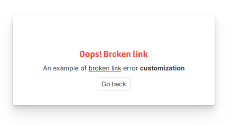
The customization settings page now includes an Error messages tab, enabling the personalization of error messages displayed across the platform. Rich-text inputs are supported.
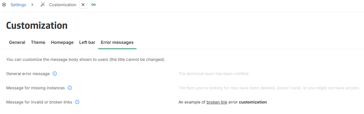
Errors that could be encountered are still:
-
General error message: Shown for unexpected errors. Our support team is automatically notified.
-
Message for missing instances: Shown when the URL is valid but the instance(s) the URL points to cannot be found. This can happen because the instance never existed, was deleted, or the user lacks access rights. Our support team is not notified.
-
Message for invalid links: Shown when the URL is invalid. Our support team is not notified.
[New] New DATE.END computing function
A new function, DATE.END, has been added to simplify date manipulation and determine the last date included in a period with a higher granularity.
See the platform’s Formula documentation page for detailed usage examples.
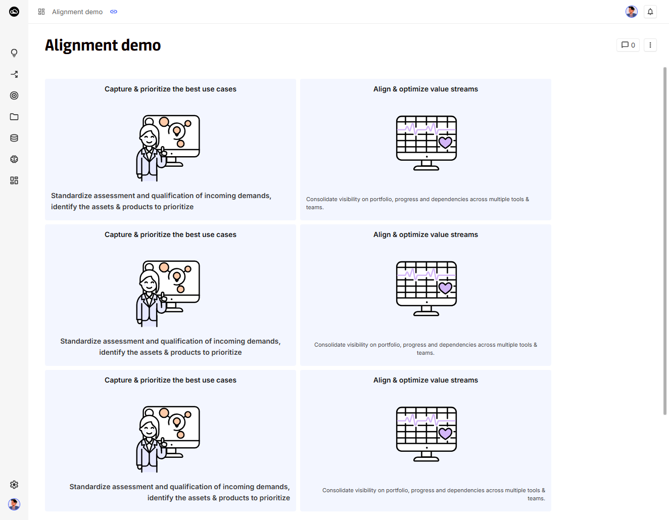
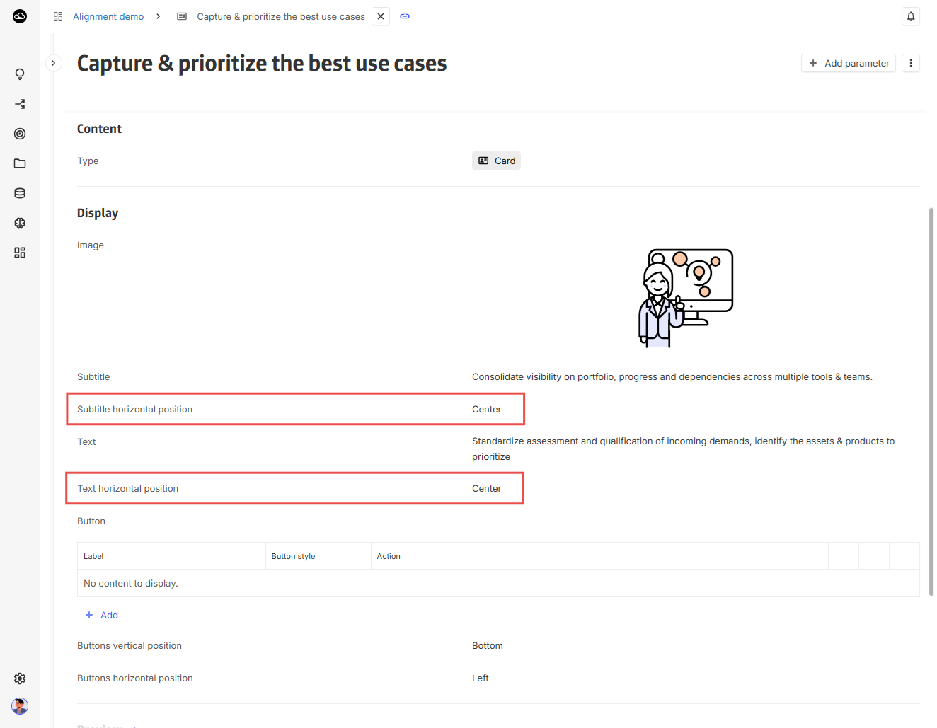
[Improvement] Card widget subtile & text alignment
The card widget now supports configuring text alignment for both the subtitle and the main text.
[Improvement] TIMESERIES.* functions now support list of timeseries
To streamline computations involving multiple timeseries, all TIMESERIES.* functions now accept lists of timeseries and return an array of results.
TIMESERIESENTRY.* functions also accept lists of entries and return arrays accordingly.
See the platform’s Formula documentation page for detailed usage examples.
[Improvement] Function operators are now listed in Formula documentation
To improve discoverability, common operators (such as +, -, =, <>, …) are now fully documented in the platform’s Formula documentation page, along with usage examples.
2025-11-27
[Breaking change] Removal of Notifications (personal emails)
Due to low adoption, performance considerations, and the overall complexity of using the feature, the Notifications (personal emails) feature has been removed.
[Improvement] Jira connector link field update
The Jira connector mapping has been updated to use the new YOOI link field.
Two properties are impacted and must now be mapped to a link field :
-
Under Jira issue object :
Issue Linkproperty -
Under the Jira Project object, the
Jira Board Linkproperty
All existing Jira connectors using these properties have been fully migrated as part of this update.
2025-11-20
[Upcoming breaking change] Removal of Notifications (personal emails)
In the next release, we will remove the Notifications (personal emails) feature.
Due to low adoption, performance considerations, and the overall complexity of using the feature, we have decided to deprecate and remove it.
If you have users relying on personal notifications, please recreate the equivalent workflows using Automations before the next release.
2025-11-06
[New] DataGalaxy connector: Mapping with link fields
The connector now maps HtmlLink type fields from DataGalaxy to link fields in YOOI, instead of treating them as plain text.
In addition, the connector now includes the externalUrl field from DataGalaxy objects. (For more details, refer to the documentation).
[New] Ignored for replication fields
Concept fields can now be marked as ignored for replication under field configuration.
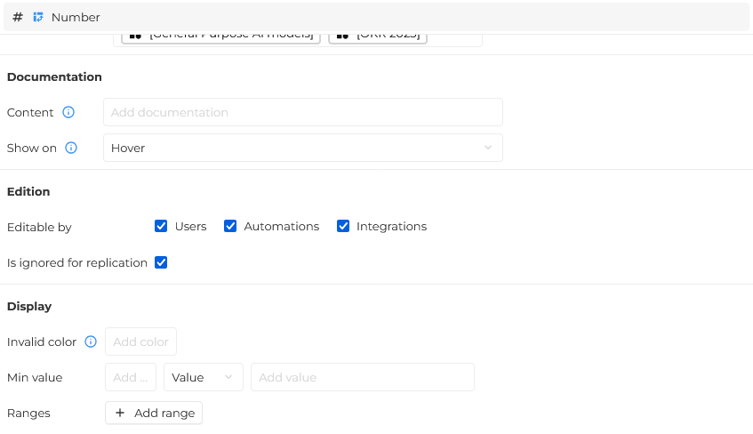
When duplicating an instance, the marked fields values will not be replicated and therefore will be empty in the instance copy
2025-10-23
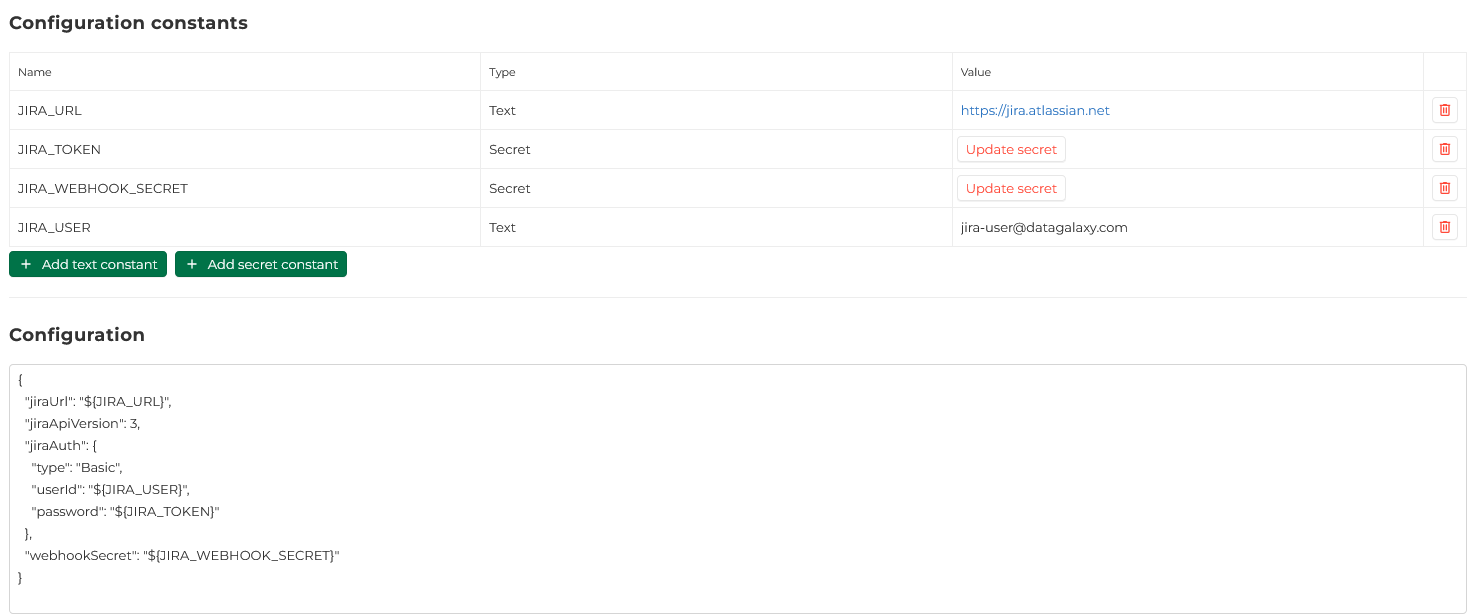
[New] Connectors configuration constant
Connectors configuration can now refer to two new types of constants:
-
Text constants, which store clear text value
-
Secret constants, which value can not be retrieved after being set.
To use a constant in a configuration simply put ${Constant_name} in the configuration.
[New] DataGalaxy connector - Links between objects
Synchronization of links between instances has been added to the DataGalaxy connector.
In order to manage to manage these n-n associations, two options (getLinks andlinkMode) have been added. Details can be found in the DataGalaxy connector documentation.
2025-10-09
[New] Link field export & automation
Link fields can now be used in automation (listen to events and generate data).
They can also be exported as a 2 columns text data (label / url).
[New] Automation - Multidimensional values update
Updating multidimensional values is available in automations.
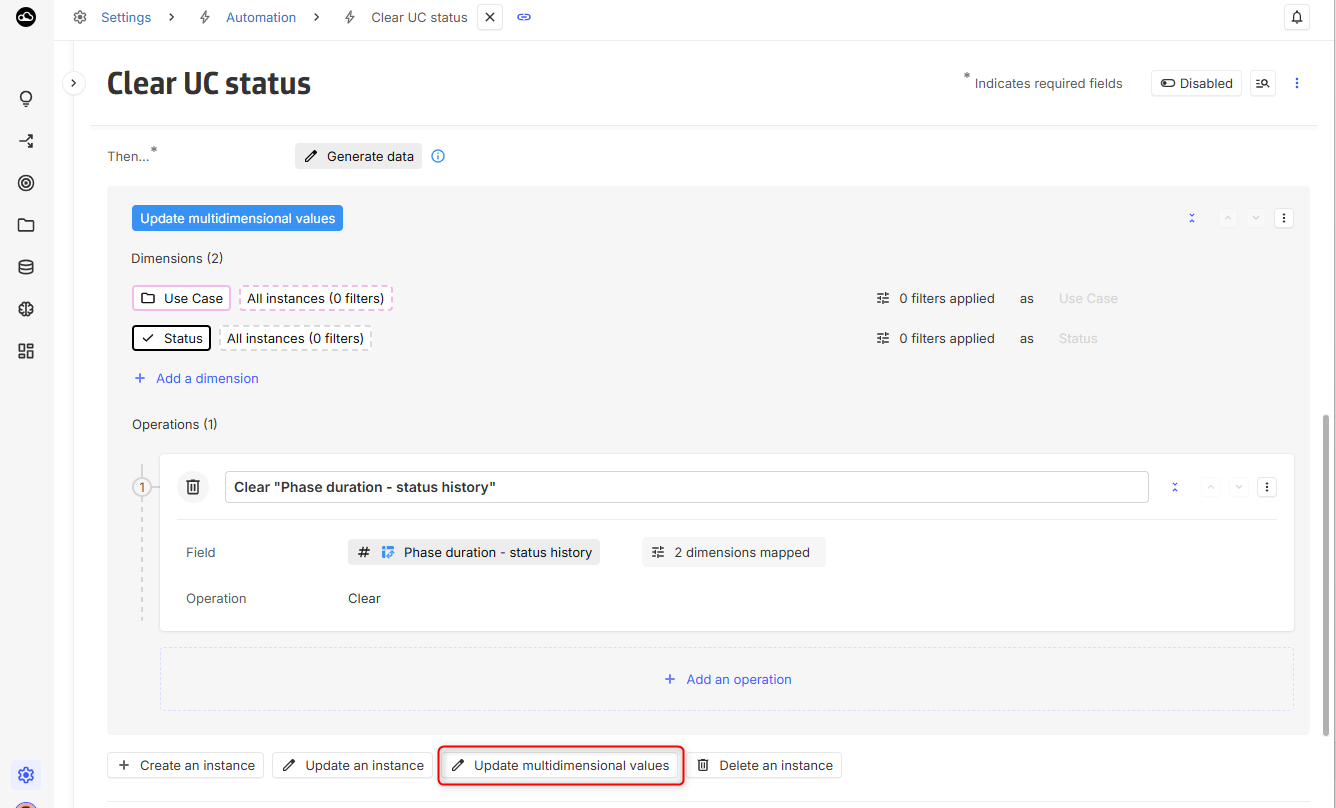
Dimensions will be mapped automatically when the field is selected, unless an ambiguity is detected.
Only fields matching all conditions will be available for update:
-
They must have at least have all defined dimensions.
-
They must not have other mandatory dimensions.
2025-09-25
[New] Link field
A new type of field is now available in the platform: the link field.
This new field's purpose is to get a clickable link to a URL while displaying a custom label.
Also, this field can be multidimensional.
For now, it can be used in layout, cards and tables as a standard field :
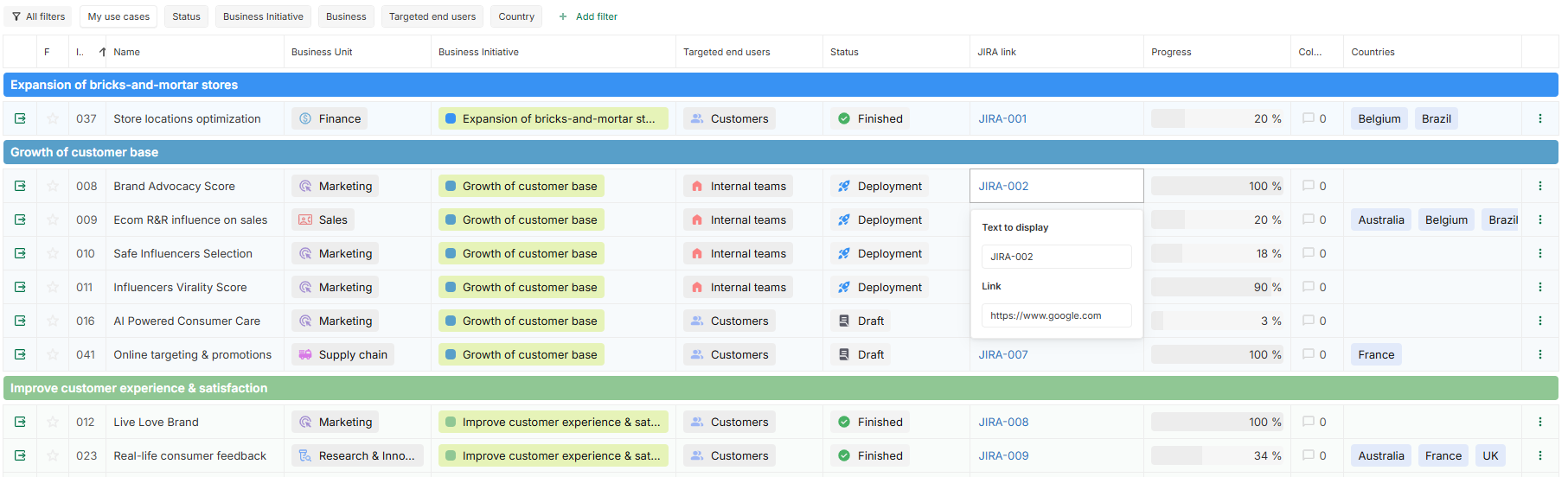
This new field comes with new computing functions : URL, URL.LABEL and URL.URL.
-
URL(url, label): creates a link field given 2 text arguments. -
URL.LABEL(linkField): extracts the label of a link field as text. -
URL.URL(linkField): extracts the url of a link field as text.
[Improvement] Jira connector now handle enumeration fields
Jira connector now handle a new type of field, the enumeration field. For more information on how the options are synchronized, you can read the documentation.
[Improvement] Collibra connector now handle roles synchronization
Collibra connector now handle role synchronization. To see how to configure it, you can check the documentation.
2025-09-11
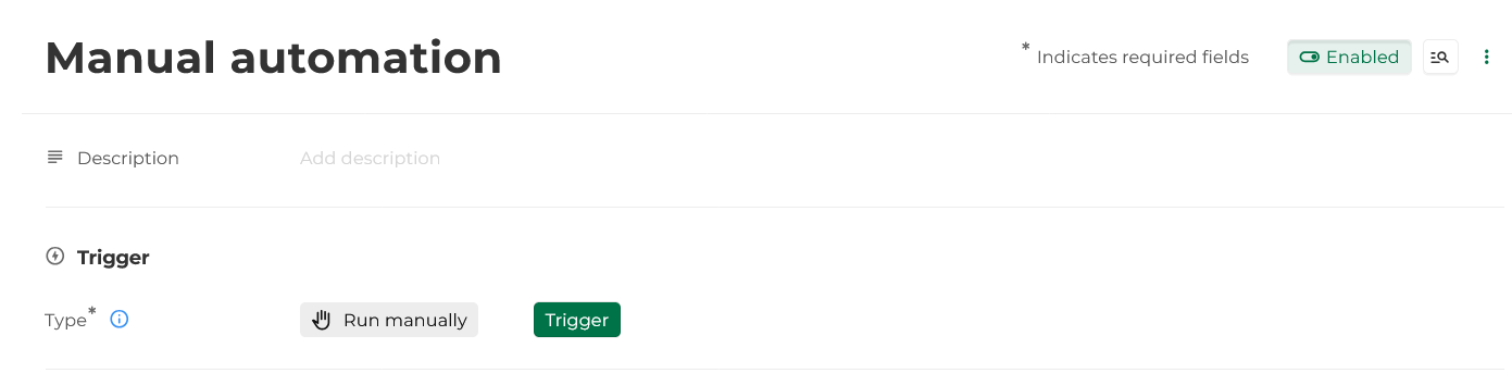
[New] Manual trigger of automation
A new type of trigger is now available for automation, run manually, when selected it will allow the automation to be run by a single click on the Trigger button.
2025-09-04
[Breaking change] DATECONVERT function deprecated
The DATECONVERT function is now deprecated in favor of the DATE function.
The DATE function provides clearer behavior and ensures more predictable results when working with dates.
To convert from the DATECONVERT(date|timestamp|string, periodicity) to the DATE(periodicity, date|timestamp|string) function, you need to switch both parameters.
DATE function returns a date object instead of a number.
In most cases this change is transparent, but if the previous numeric behavior is needed, DATE result can be wrapped in TIMESTAMP.START (e.g. TIMESTAMP.START(DATE(period, date))).
The DATECONVERT function will be removed in the coming weeks.
[New] New NOW functions
To simplify working with computing relative to now, the following functions have been added:
-
NOW.DAY(): Returns a date object representing the current day. -
NOW.WEEK(): Returns a date object representing the current week. -
NOW.MONTH(): Returns a date object representing the current month. -
NOW.QUARTER(): Returns a date object representing the current quarter. -
NOW.YEAR(): Returns a date object representing the current year.
See the platform Formula documentation page for detailed usage examples.
[New] New date computing functions
Several new functions have been added to make working with dates easier and more flexible:
-
DATE(periodicity, date|timestamp|string): Creates and aligns a date. -
DATE.ADD(date, periodicity, scalar): Adds a duration to a given date. -
DATE.PERIOD(date): Returns the period of a given date. -
TIMESTAMP.START(date|dateRange): Returns the start timestamp of the given date or date range. -
TIMESTAMP.END(date|dateRange): Returns the end timestamp of the given date or date range.
See the platform Formula documentation page for detailed usage examples.
[New] Computing support for date range field
Date range fields now support computings.
When used in timeline, manual ranking of instances is disabled.
To create or manipulate date range, the following function has been added:
-
DATERANGE(periodicity, date|timestamp|string, date|timestamp|string): Creates and aligns a date range. -
DATERANGE.PERIOD(dateRange): Returns the period of a given date range. -
DATERANGE.START(dateRange): Return the start of a given date range. -
DATERANGE.END(dateRange): Return the end of a given date range.
See the platform Formula documentation page for detailed usage examples.
Date range can also now safely be compared to NULL.
[Improvement] Field name color for better readability
Field name displayed in layouts now uses a darker gray to improve readability and visual clarity.

2025-08-28
[New] DataGalaxy connector
DataGalaxy governance objects, strategy objects, product objects and tree representation are now available.
See the documentation for more information.
[Improvement] Formula input ordering
Formula inputs can now be reordered to make formulas easier to read and maintain.
This change only affects how inputs are displayed, formula execution remains unchanged.
[Improvement] Formula error display
Formula validation has been improved for better clarity and debugging:
-
Unparsable formulas, unknown inputs, or unknown functions are now reported with specific error messages (instead of a generic one).
-
Deprecated functions are now flagged with a warning.
2025-08-21
[Breaking change] Improved predictability of date range evaluation
The date range field has been redesigned for greater consistency and reliability across the UI, automation, and REST API.
Key changes:
Range
-
Dates can only be set between 1970 and 3000.
Start constraints
-
A Start constraint without a delay will no longer be implicitly treated as Start delay set to 0.
-
To be evaluated, a Start delay need to be explicitely set.
-
To ease updating the input, when openning a date range without value:
-
The default Start date is now set to Fixed (instead of Constrained).
-
When switched to Constrained, the Start delay is automatically set to 0.
-
Use in computing
-
Invalid date range (e.g. invalid dates, start > end, negative durations, Constrained without start constraint, …) now returns an error instead of a partially filled value.
-
Returned value are now fully evaluated instead of being partially evaluated
-
e.g. Using
MAX(DateRange)now returns the resolved end timestamp instead of the selected date or the number of period.
-
Use in automation
-
Copying a date range value using a path now copy the resolved dates (as Fixed) instead of a partial copy of the current value.
Previously, constrained start dates with a delay set the resolved timestamp as Start delay leading to invalid date range.
REST API
-
Returned values now reflect how the date range is stored (e.g. Start delay as a number of periods instead of a resolved date).
-
Updates are subject to stricter validation and must follow this schema:
{
  "period": "day | week | month | quarter | year",
  "from": {
    "type": "date | next | last | constraint",
    "value": number
  },
  "to": {
    "type": "date | next | last | duration",
    "value": number
  }
}
Where
fromortocan be omitted but at least one should be set.
2025-08-13
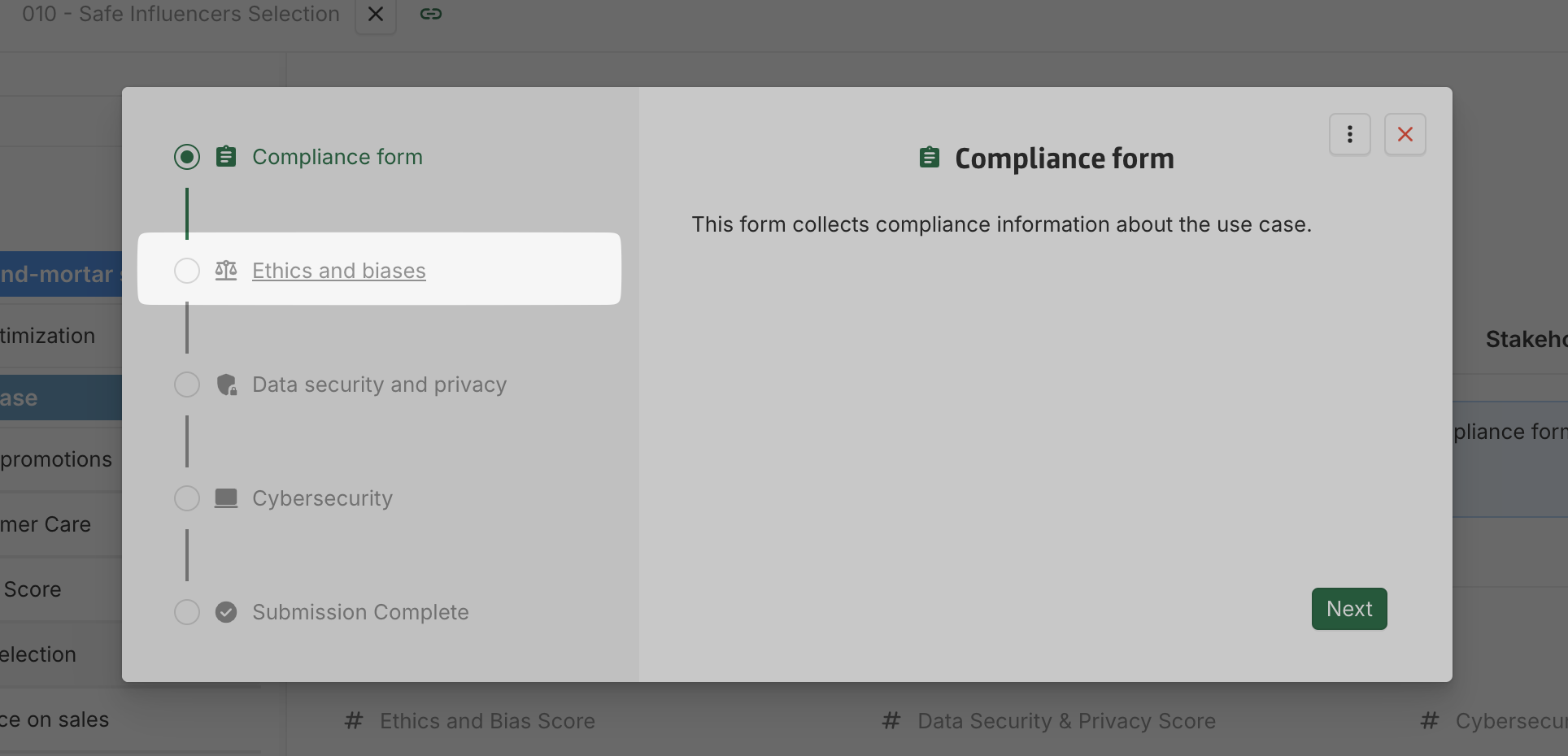
[New] Form: Navigation via Form pages tracker
Users can now navigate directly between eligible form pages using the Form pages tracker. Pages connected via Go to next page actions are freely accessible, except when a workflow transition is required (those must be completed sequentially). Hovering over a page name in the tracker now underlines it and changes the cursor to indicate clickability.
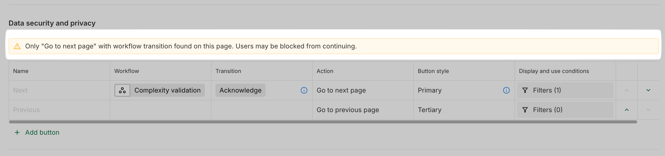
[New] Form: Sanity checks for admins
When configuring Page transitions, admins now receive warnings if a page has no Go to next page button (except on the final page) or only Go to next page buttons with workflow transitions. This helps prevent misconfigurations that could block users from progressing.
[New] Form: New admin options in configuration
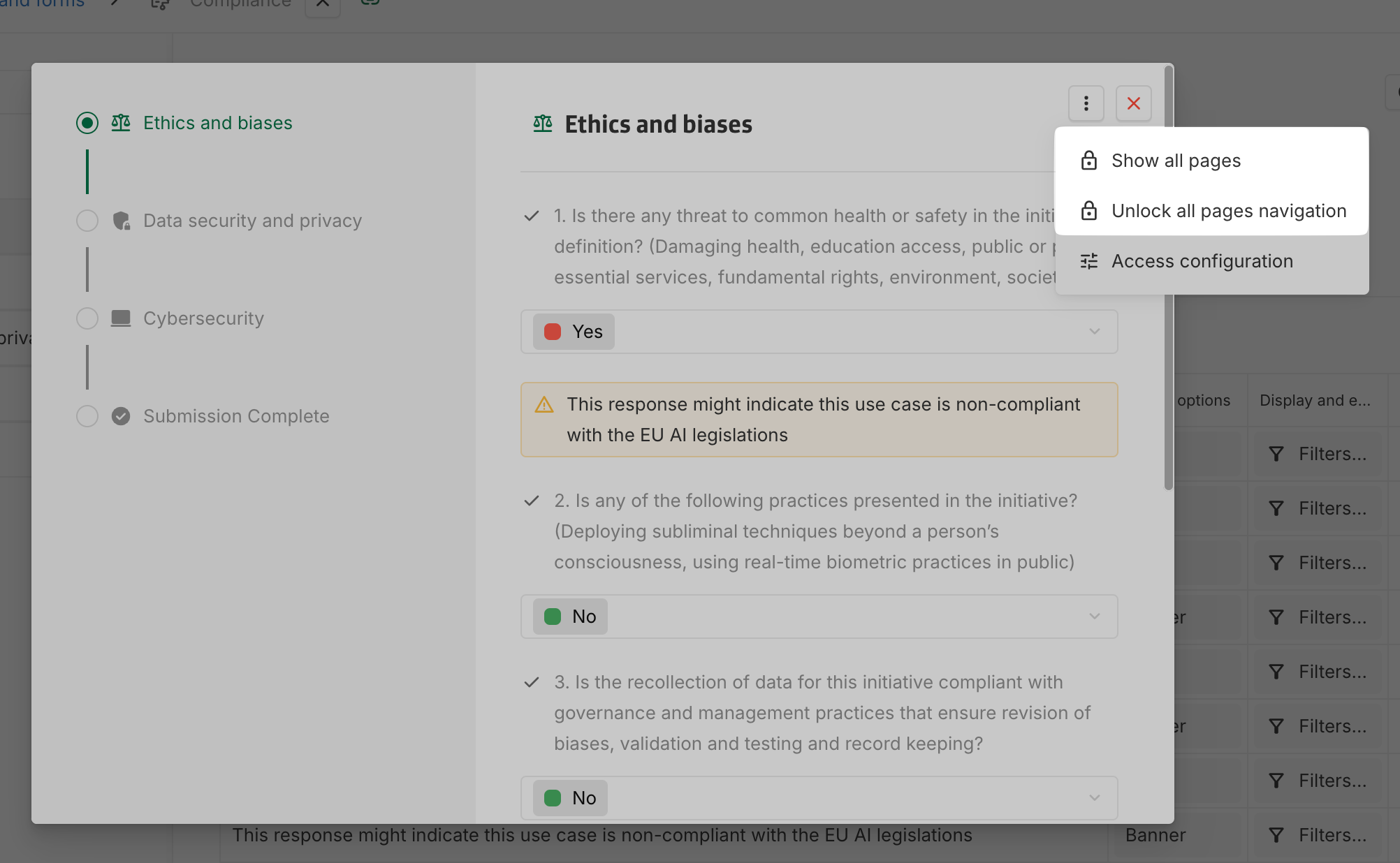
Two new options have been added for admins in the form configuration when displaying a form via Open form… option:
-
Show all pages: Displays all pages of the form regardless of any applied filters.
-
Unlock all page navigation: Enables navigation through all pages via the form page tracker, removing restrictions.
These options assist admins in validating their form configurations more efficiently.
2025-07-31
[Improvement] Collibra connector: support for n-1 associations
The Collibra connector now supports the synchronization of n-1 associations.
Associations targeting a synchronized type are now displayed in the mapping screen.
More informations about the connector can be found in the documentation.
2025-07-10
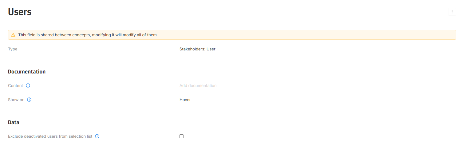
[New] Exclude deactivated users from selection list
A new option, Exclude deactivated users from selection list, is now available in the Stakeholders: User field configuration.
When enabled, deactivated users are filtered from selection lists when assigning a user to a role, while users who were already assigned continue to be displayed without errors.
[Improvement] Support for multiple sources in Graph Charts
Graph chart nodes can now be configured to pull data from multiple sources.
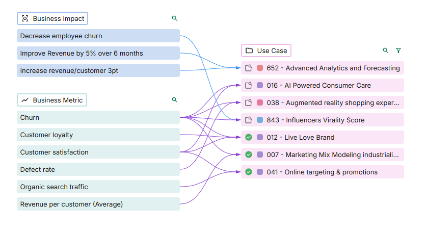
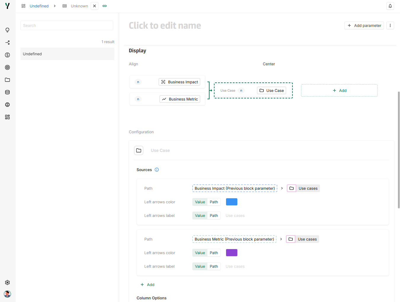
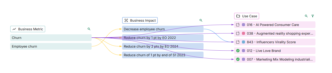
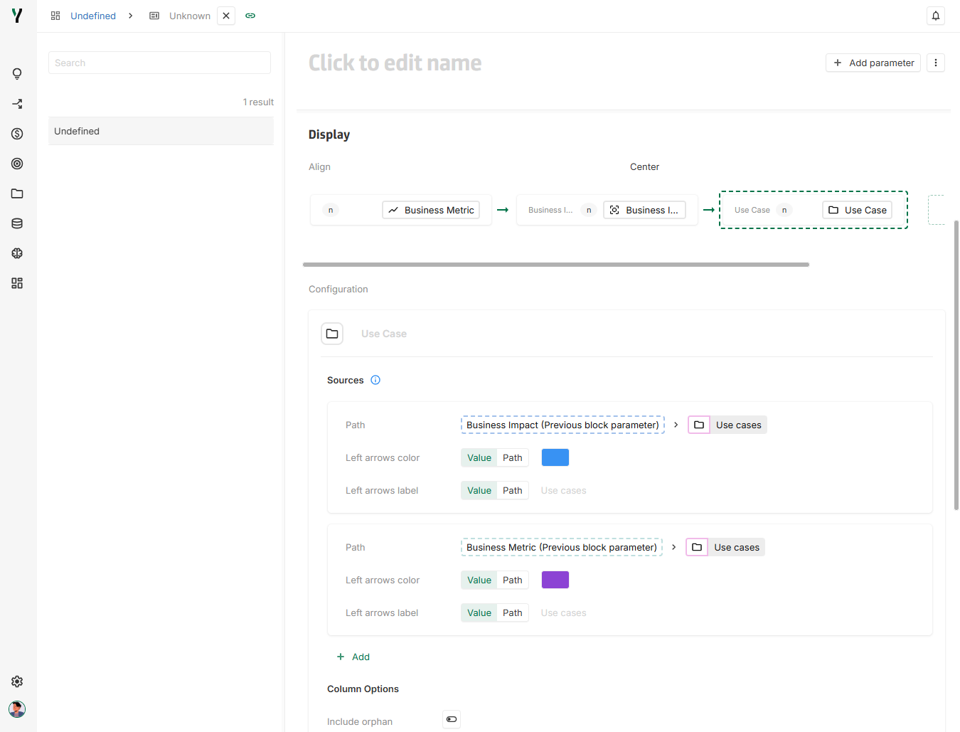
[Improvement] Graph Chart sources can reference all previous nodes
Previously, a graph chart source could reference only the immediately preceding node. Now, it can pull data from all nodes that come before the current one.
2025-07-03
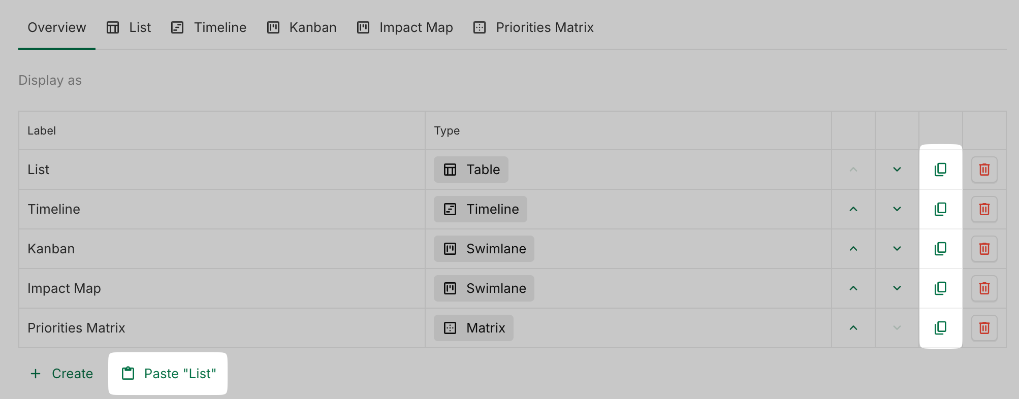
[New] Copy and paste views
Views can now be copied and pasted, provided the target view uses the same dimensions. This feature replaces the former Use concept default view configuration, which has now been deleted.
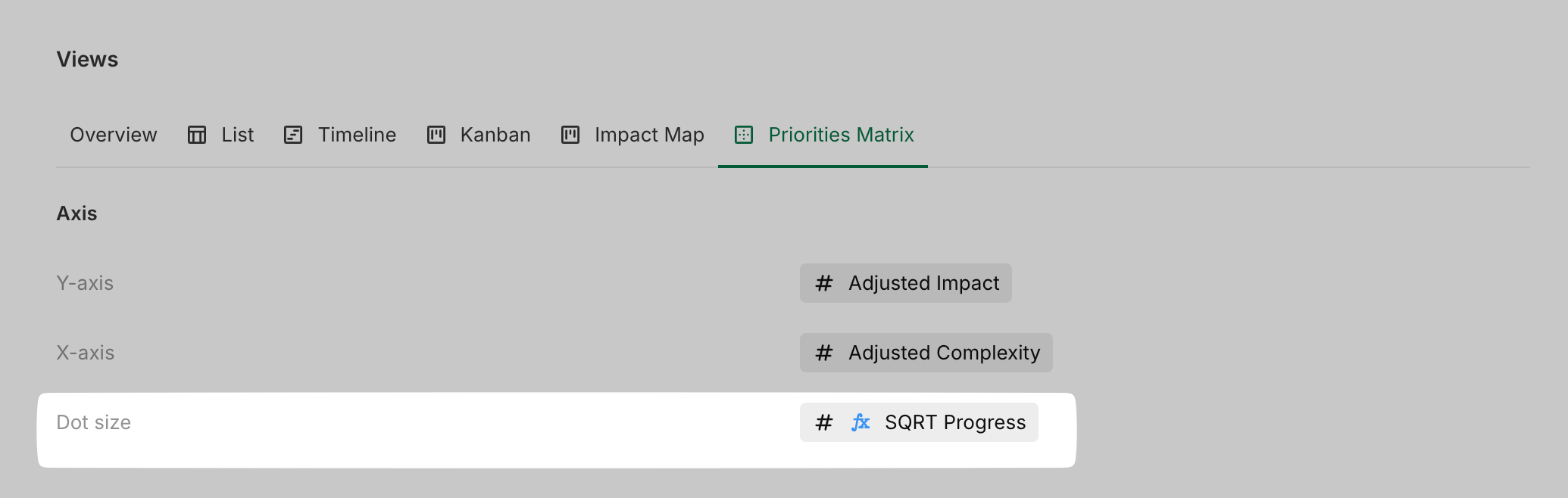
[New] Dot size based on values in matrix view
Dot size can now be configured dynamically based on numeric values in the matrix view.
Note: This feature is exclusive to the matrix view and not available in the matrix library view, which will be deleted soon.